Elements of Art: Color 🎨
- Art Studio 760
- Jan 27
- 5 min read

What’s Your Favorite Color? 🌈
I love orange! And if you ask any kid what their favorite color is, they usually have a pretty strong opinion. From the youngest artists grabbing for crayons to older kids and teens making more aesthetic choices, most students feel completely at ease playing with color. That’s why color is such a fun element to teach: with just a little bit of Color Wheel guidance and simple color theory, their artwork can level up fast. It’s always amazing to watch how quickly their confidence (and their paintings!) improve once they understand how colors relate to each other.
The Color Wheel: Our Foundation

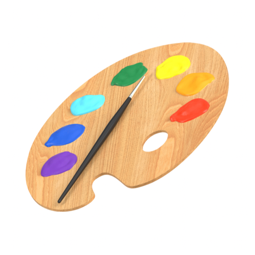
At Art Studio 760, one of our favorite tools is the Color Wheel. We keep Color Wheels out and visible while students work so they can see how colors relate to each other—what’s in the same color family, which colors are warm or cool, and which combinations will make their artwork feel bold, calm, or balanced. It also helps in a very practical way: when kids have lots of paint on their palette, the Color Wheel supports smarter choices and helps them avoid mixing muddy hues.
The Color Wheel is like a friendly map. It shows:
Primary colors (red, yellow, blue) — the building blocks
Secondary colors (orange, green, violet) — made by mixing two primaries
Tertiary colors (like red-orange, blue-green) — the “in-between” colors that make artwork feel rich and nuanced
When students glance at the Color Wheel while they paint, they start noticing patterns:
“Those are neighbors.” “Those are opposites.” “That’s a warm color.”
That’s where confident color choices begin.
Warm + cool colors (and why they matter)
A Color Wheel also makes it easy to spot warm vs. cool colors:
Warm colors—reds, oranges, yellows—often feel like sunlight, energy, and closeness.
Cool colors—blues, greens, purples—tend to feel calm, quiet, and farther away.
A simple artist trick we teach:
Warm colors can “come forward”
Cool colors can “move back”
So if a student wants something to stand out, they can warm it up, make it more intense, or place it against cooler colors for contrast.
Color families: neighbors on the Color Wheel

Colors that sit right next to each other on the Color Wheel are in the same “family.” These are called analogous colors—like blue, blue-green, and green. They’re literally touching on the Color Wheel… it’s almost like they’re holding hands. Because they’re so closely related, they usually feel harmonious and naturally “go together” in an artwork.
Studio tip: If a student isn’t sure how to choose colors, we’ll suggest picking one section of the Color Wheel and building from there. It keeps the artwork looking connected and intentional.
Color opposites: high-contrast pairs
Colors that sit across from each other are complementary colors—like blue + orange, red + green, yellow + purple. These pairs create strong contrast and can make artwork feel extra lively.
Try this: Use one color as the “main” color, and use its complement in small pops to help the focal point stand out.
Sometimes color is just playful experimenting

Of course, sometimes the best way to learn color is simply to play. We love giving students a canvas (or sturdy paper) and encouraging them to try colors in an experimental way—layering, blending, mixing, and seeing what happens.
Some of that experimentation can come from looking at master artists for inspiration:
the cool, magical tones in Vincent van Gogh’s Starry Night
the bold, glowing warm tones in Georgia O’Keeffe’s poppies
When kids realize that artists use color on purpose—and also use color for pure joy—it opens up so many possibilities.
How we help kids avoid muddy mixing
When students get excited and start mixing “everything,” colors can turn brownish or dull fast. The Color Wheel helps them pause and make clearer decisions.
A few simple studio strategies:
Limit the palette: choose 3–5 colors to start, then build slowly
Rinse between mixes: clean water and a quick brush wipe makes a big difference
Mix with intention: mix neighbors for smoother blends, save opposites for contrast
Keep a “test corner”: try a tiny mix on scrap paper before putting it on the artwork
What is color, really?
When I was thinking about how to explain color in a simple, meaningful way, I went into the art library and found the Betty Edwards book on color. It was a good reminder that color affects the overall feeling of the artwork.
And that’s a big deal, because art is always telling a story. Sometimes we notice the subject first—a landscape, a portrait, a flower, a city scene—but very often our first impression comes from the color. Color can feel bold or bright, calm or relaxing, energetic or dramatic—and those feelings shape the story we experience before we even name what we’re looking at. In other words, color doesn’t just support the artwork… color tells a major part of the story.

In the simplest terms, color is created when light hits an object and reflects back to our eyes. Artists use color to create mood, show space, guide the viewer’s attention, and help a picture feel unified.
When we talk about color in art, we use three building blocks:
1) Hue: “What color is it?”
Hue is the name of the color—red, blue, yellow, etc.
2) Value: “How light or dark is it?”
A light blue and a dark blue can feel completely different. Value helps show shadows and dimension.
3) Intensity: “How bright or muted is it?”
Intensity is how vivid or dull a color looks—neon vs. dusty, bold vs. gentle.
The 1-2-3 Spark Challenge
1. Choose one “home base” color on the Color Wheel (your main color).
2. Pick two outer colors—one on the left side of your home base, and one on the right side. (These are your supporting colors.)
3. Finally, pick one opposite color (directly across from your home base) and use it as a tiny “spark”—just a small detail to help your focal point pop.
This shows students that color isn’t just decoration—it’s storytelling.
Try it at home: Color Family Collage + Spark
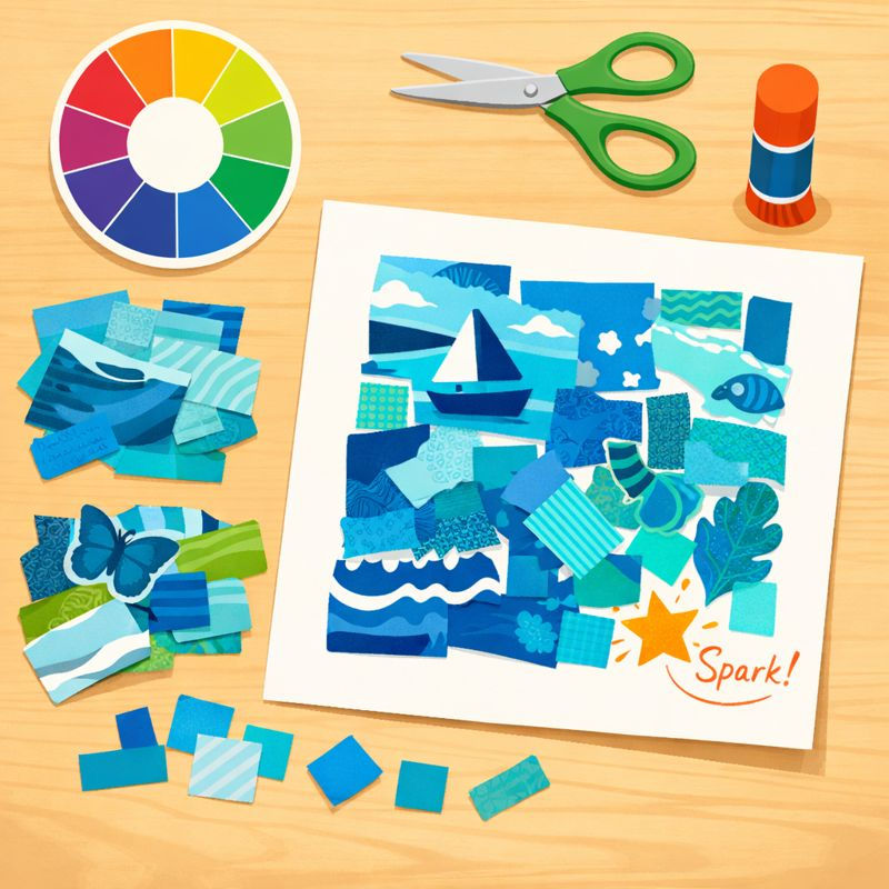
If you have old magazines, coupons, or even colorful junk mail lying around, here’s a simple (and surprisingly fun) way to practice color at home.
What you’ll need
Old magazines, catalogs, coupons, or junk mail
Scissors
Glue stick or tape
A piece of paper or cardboard (any size)
Step 1: Pick one Color Wheel “family”
Choose one section of the Color Wheel—for example:
blues + blue-greens
reds + red-oranges
yellows + yellow-greens
Then start hunting for images, patterns, and words in that color family.
Step 2: Build your collage
Cut out as many matching pieces as you can and glue them onto your page. Try to collect a mix of:
big shapes and tiny shapes
photos, patterns, and text
light and dark versions of your color
It’s a great way for kids to notice how many “kinds” of one color exist.
Step 3: Add the “Spark” (the 1-2-3 version!)
Once your collage is mostly one color family, try the 1-2-3 Spark Challenge using paper:
1. Choose your home base color family (that’s your collage theme).
2. Add two outer colors—one on the left side of your home base on the Color Wheel, and one on the right side (just a few pieces each).
3. Add one opposite color as a tiny “spark” (a few small cutouts or even one bold detail).
That little opposite-color spark can instantly make the collage feel more exciting—and it’s an easy way to see color theory in action.
Want to explore color at Art Studio 760?

Color is one of my favorite elements to teach because students see results quickly, and they start making choices with confidence and intention.
Our Summer Art Program at Art Studio 760 is officially open for registration—and we’re doing a different color theme each week. It’s a fun way for kids to build confidence with color mixing, mood, and bold creative choices while making artwork they’re proud to bring home. Registration is now open—save your spot today.
Want to explore art before summer? Register for a kids’ art class now or save your spot for our February or April camp weeks.


Comments